
The key to property branding
Hocking is a long-established Cornish property business.
They asked us to help with their branding.
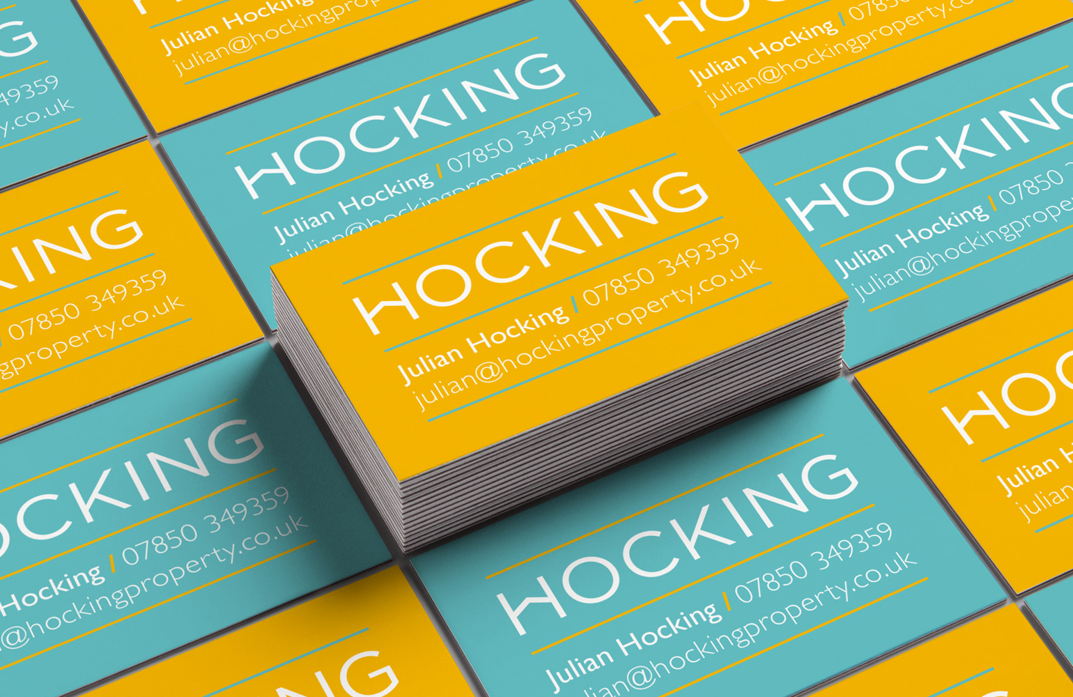
The simple typographic solution for the logo, saw the crossbar of the H ‘vaulted’, to leave the negative space of a house.
Inspiration for the colour palette came from the local landscape.
Property branding all under one roof!