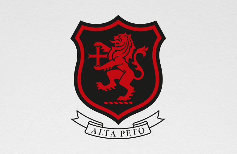
Tiffin logo designed by the Joneses
Old Tiffin logo redesigned by The Joneses
Tiffin logo application designed by The Joneses
Tiffin manifesto written by the Joneses
Tiffin Boat Club logo designed by The Joneses

Described as “a magnificent school” by ‘The Good Schools Guide’, Tiffin is a prestigious state school known for its outstanding academic results and an exceptional range of co-curricular activities.

Collaborating with the Senior Leadership Team and the Governors, we emphasised the importance of perceiving the school as a cohesive brand – making it more unified, agile, consistent, and understood.

The school’s heraldic crest, derived from Kingston’s 1441 town seal, had become degraded and difficult to use. So our first stop was to explore the school’s extensive archives where we uncovered evidence of a simpler identity. This discovery inspired our interpretation and led to the creation of a new, historically authentic logo that honours and refines the school’s heritage.

Tiffin’s historic motto, “faire sans dire” (do without saying), was integral to our discussions on vision, values, and tone of voice, and our insights were encapsulated in a compelling manifesto.

The new brand is being implemented across all touchpoints, with our guidance throughout the process.

Hopefully we’ve made the grade!

“Thank you so much for all your amazing work on the rebrand. It’s great to have such a consistent, clean and professional identity – you have made a huge difference for the school!”

Garth Williams – Headteacher
aha book cover designed by The Joneses

All manner of “useful stuff” hides in our loft; Christmas decorations, best-forgotten school reports, CDs, all the unwanted presents that’ll be good for someone else and the occasional old piece of work too.

This was a cover for a book in which advertising types told of the moment they realised they were creative. Not particularly interesting reading, but it’s a nice cover!

Il Pozzo branding by The Joneses

We’ve recently been working on a property branding project for a luxurious villa in Tuscany.

Il Pozzo, which is Italian for “the well” is a stunning property near Pienza that has just undergone a huge renovation project.

We’ve created the branding, marketing materials and a responsive website for the client. You can read more about the project here.

Well done?

Masked Ball poster designed by The Joneses for Holy Cross Prep School
Masked Ball graphics designed by The Joneses

One of the perils of being a designer is that you often get asked to design things like wedding invitations and birthday cards for friends and family. Needless to say, I’ve done more than my fair share of freebies over the years!

This is the latest “favour”; all the brand collateral for the forthcoming masked ball at my daughters’ school.

Roxbury Asset Management logo designed by The Joneses

We’ve just finished an identity for Roxbury – a new asset management business.

Their new logo is inspired by the mountain ranges of Roxbury, Connecticut.

You can read more about it here.

Bootcamp Pilates dazzle pattern designed by The Joneses

We’ve just launched a new identity for Bootcamp Pilates, the pioneer of Dynamic Reformer Pilates in London.

Their new brand strategy, identity and responsive website were inspired by Norman Wilkinson’s dazzle patterns which were originally devised to disguise ships in World War I.

You can find out more about the project here.

Cut and Construct logo designed by The Joneses

We’ve been working on an identity project for Jersey-based construction business, Cut and Construct – here’s the new logo. Owner, Eddy Cutler wanted to communicate the precision, process and scale of their business which we achieved through a simple typographic tessellation. We’ll post more of the applications on the work page soon.

The Joneses get a credit from Tasmania Perry

Having just finished reading Tasmina Perry’s ‘Perfect Strangers’ my wife noticed a rather splendid name check in the back! I’m secretly hoping that it was for inspiring one of the smouldering characters rather than a bit of art direction! Hollywood, you have my number!

Kingston Choral Society Crossing the Lines poster designed by The Joneses

Kingston Choral Society’s Autumn concert is called ‘Crossing the Lines: Remembering the Great War’.

Our idea for the poster was simple and evocative. Poppies are used to remember the war and hugely symbolic of the loss incurred, so we simply took the title of the concert and arranged it as the stamen of a graphic poppy. All lined up to 11 on the clock face as it should be!

Silence please…

Probably as a result of watching all the medal ceremonies at the Commonwealth Games, my daughters reminded me of a poster and programme I did for their school’s Olympic Festival a couple of years ago. I thought it was quite nice so decided a topical share was in order.

LMG print test designed by The Joneses

We have just launched our latest project – a rebrand of Line Management, one of the UK’s leading providers of technology, managed services and innovative solutions for workspaces and data centres. You can read more about it here.