Keep up

News, views and general musings from the well-worn Joneses soapbox.

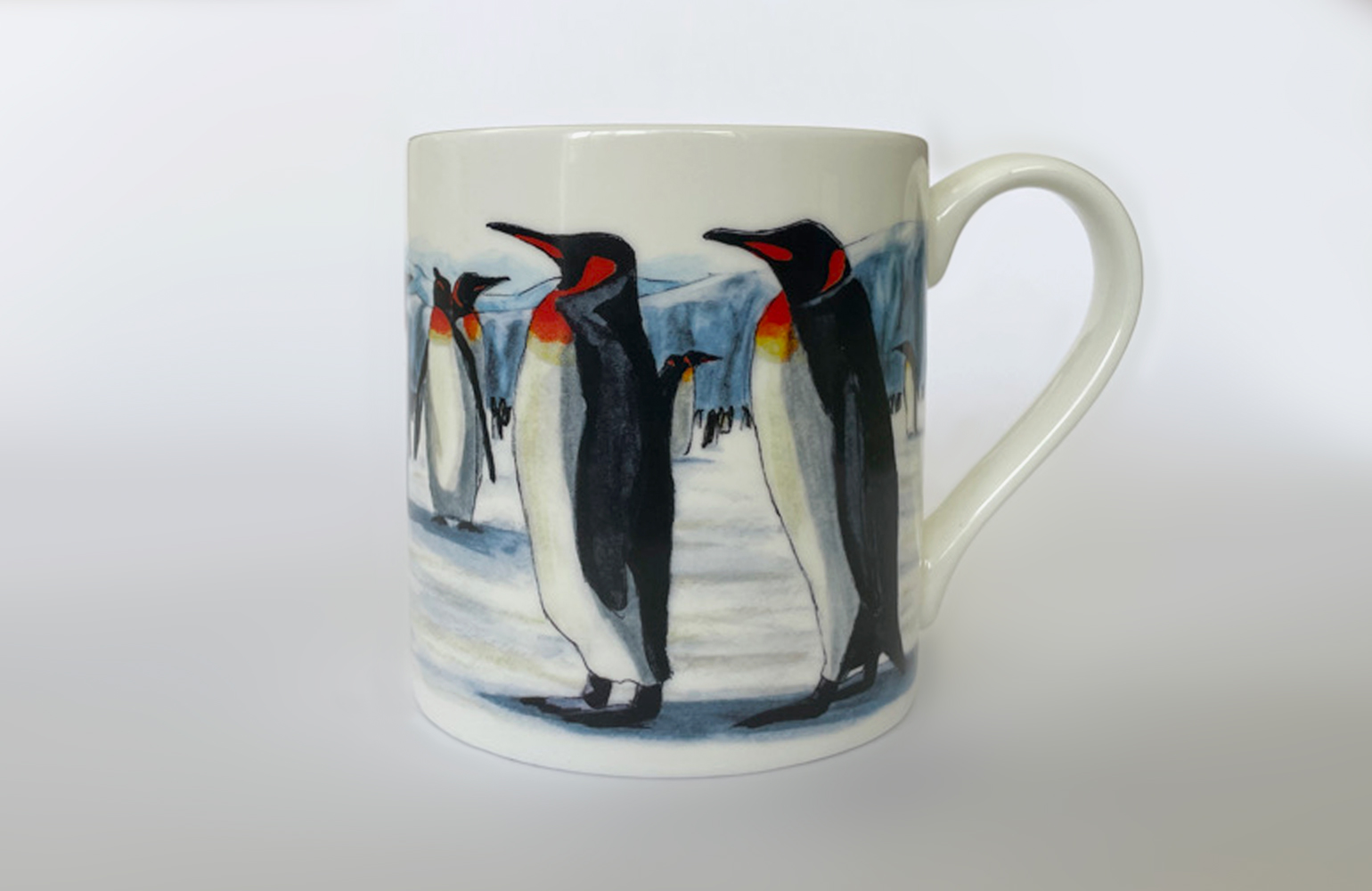
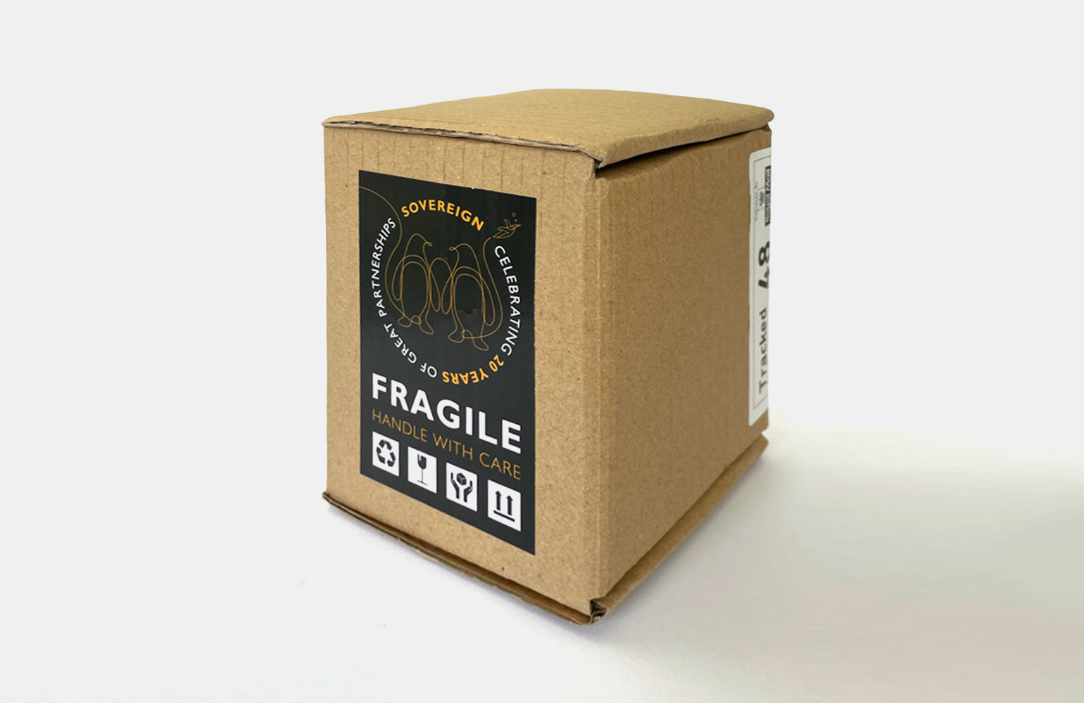
Sovereign Capital mug designed by The Joneses
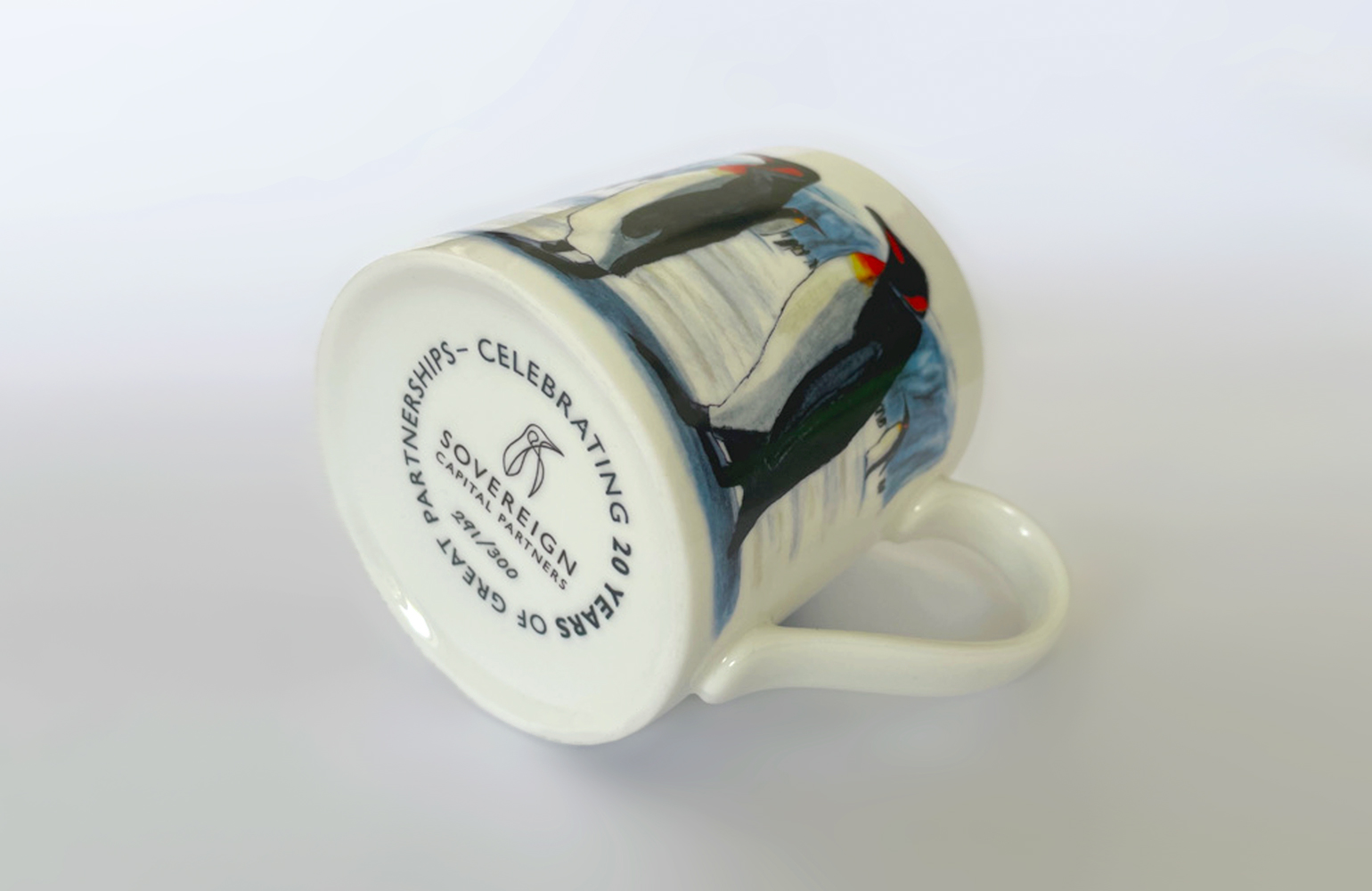
Sovereign Capital mug detail designed by The Joneses
Sovereign Capital mug box designed by The Joneses

Tea for two…

Another project to commemorate Sovereign Capital’s 20th anniversary.

In recognition of the penguin identity, so synonymous with Sovereign, we commissioned Edinburgh artist, Christopher McColl, to capture these wonderful birds in watercolour and ink.

The illustration was printed on a limited edition porcelain mug (the traditional anniversary gift for 20 years of partnership) and shared with all the advisors and investors that have been alongside them on the journey.

Builders, milk and one sugar please.

Nationwide Print advertising by The Joneses

G whiz…

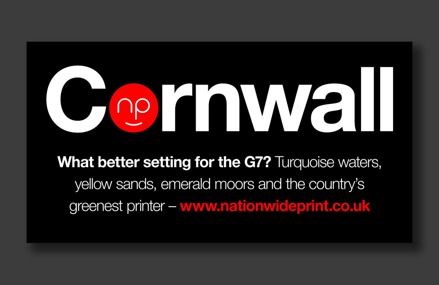
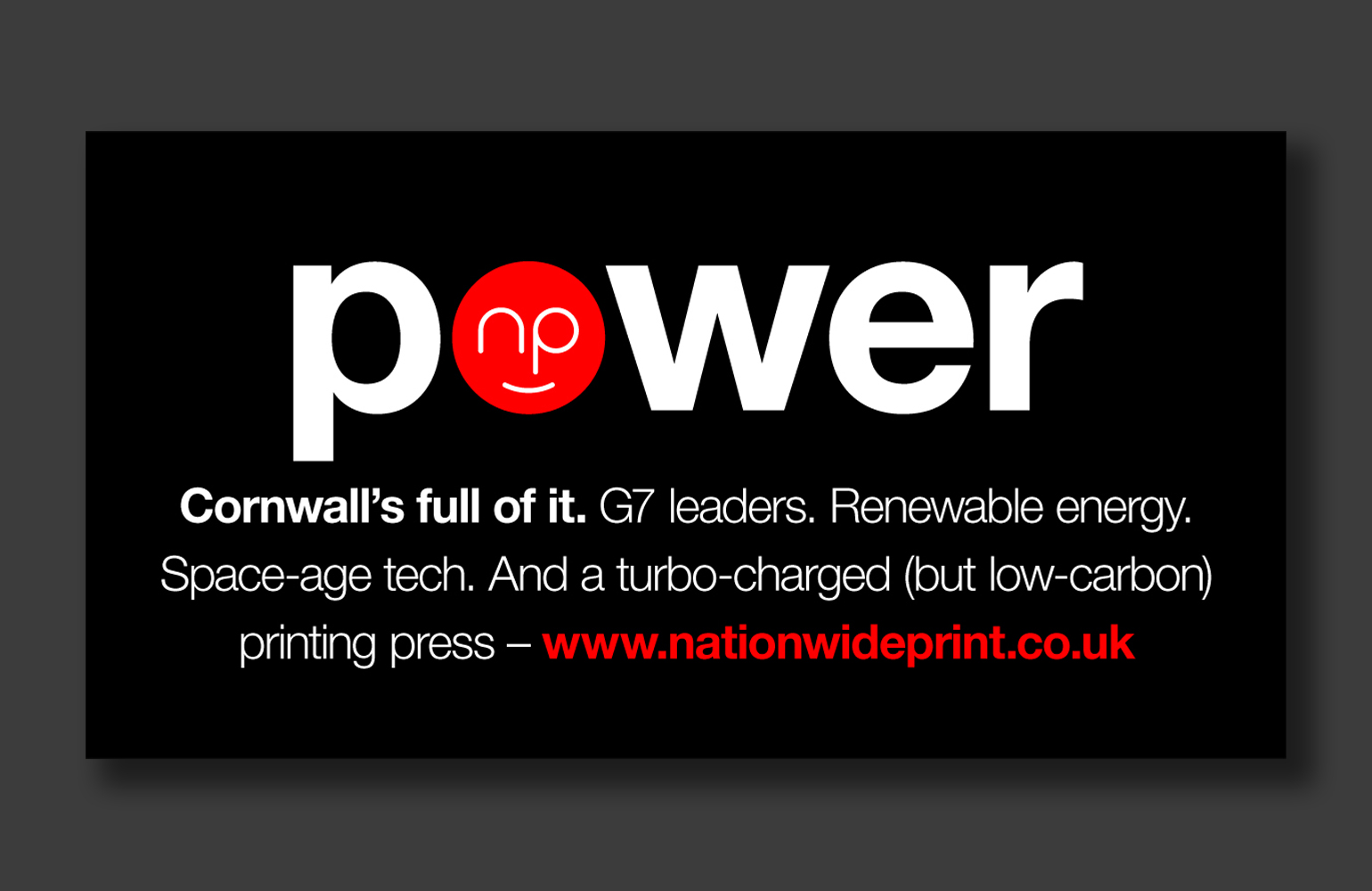
When news broke that the G7 would be spending their holidays in Cornwall, our longstanding St. Austell-based client, Nationwide Print, asked us to come up with a series of themed digital ads to “celebrate” the event.

Our typographic solution substituted their logo for the ‘O’ in some relevant words, and witty copywriting expanded on the parallels between the worlds of Presidents and print!

Politically correct for a change!

Betty's Coffee logo designed by the Joneses
Betty's Coffee cups designed by the Joneses
Betty's Coffee branding designed by the Joneses

The perfect blend…

We’ve been working with one of the UK’s largest coffee franchisees to develop a brand for a fleet of coffee vans.

Their code name for the prototype van was Betty – we thought that was interesting!

We liked the idea of Betty being an ethereal character and not a van. We liked the idea of Betty being beautiful. And we liked the idea of Betty being passionate about great-tasting coffee.

So, inspired by the client and her love of lippy, we drew a cup to look like a face with an ear, then added a mouth and a swirly hairstyle to give the identity some glamour and personality!

Words cannot espresso how well it’s gone down!

Sovereign Capital illustrations designed by The Joneses

Some things just go well together…

This year marks Sovereign Capital’s 20th anniversary, and we’re proud to say we’ve been with them for the whole journey!

As part of the celebrations, we created a short animated film that acknowledges some of the great partnerships they’ve made along the way.

Teamwork makes the dream work!

Swire Charitable Trust website designed by the Joneses
Swire Charitable Trust website designed by The Joneses
Swire Chinese Language Foundation website designed by the Joneses
Swire Chinese Language Foundation stationery designed by The Joneses

Charity begins at the homepage…

John Swire & Sons Ltd, the London-headquartered parent company of the Swire Group – a diverse business group employing over 120,000 people worldwide, approached us to help them with the rebranding of two of their philanthropic ventures; The Swire Charitable Trust, which supports the work of charitable organisations in the UK, and The Swire Chinese Language Foundation, whose aim is to broaden the reach and improve the quality of Mandarin Chinese teaching in the UK.

Our brief was to create simple logotypes, provide compelling copywriting and design and build clean, easy to use responsive websites that could be easily adapted across the group.

Not he who has much is rich, but he who gives much.

“As a relatively inexperienced charity, some serious hand-holding was needed at every stage of the journey and the Joneses not only guided us expertly, but were also a total delight to work with.”

Sarah Irving – Grants Manager
Pailleres logo designed by The Joneses
Pailleres website designed by The Joneses

The needle in the haystack…

Paillères is a secluded, ancient Provençal farmhouse hidden deep within the Luberon Park.

We were asked to help with the marketing of the property by designing a new a logo and website.

Paillères loosely translates as haystack, so in a nod to Monet’s series of paintings, and the history of the house, we designed a typographic logo to reflect that.

The single-page, responsive website paints an attractive picture of the beautiful house and grounds and positions it amid the stunning scenery, picturesque villages perchés and colourful markets that surround it.

A sharp piece of work, or un travail pointu – as they say in France!

“We have loved the highly creative, very friendly and efficient service the Joneses have provided. Bravo!”

Edward & Ruth Watson
Reformertime logo designed by The Joneses

A bit of a stretch…

We enjoy a spot of pilates at Jones Towers, so we were delighted to lend a hand when we were asked to help brand a new venture.

Reformertime is a new web-based pilates business that supplies reformer beds to clients then provides classes online.

Our idea was to take the ‘R’ for Reformertime, turn it into a person, then sit it on the name to look like someone exercising on a reformer.

A nicely balanced identity!

“So simple, so distinctive and sums up the business brilliantly – thank you!”

Katherine Wood – Founder
2020 graphic designed by The Joneses

A bumpy ride…

I’ll be very glad to see the back of 2020.

I hope the road ahead is smoother for all.

The Cox Hub logo designed by The Joneses
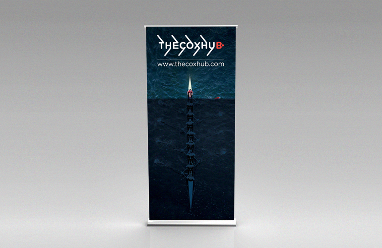
Cox Hub banner designed by The Joneses

Take a bow…

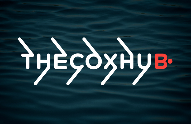
We were recently asked to devise a name and create a logo for a new niche rowing brand – an online repository for all things coxing: coaching, advice, forums, interviews and useful articles.

We thought it would be great if we could find a name that not only alluded to this specialist meeting place, but also consisted of nine letters to symbolise the eight rowers and the cox in an octuple racing boat.

The Cox Hub was chosen as the name, and the minimalist typographic logo was enhanced by adding graphic oars to eight of the letters and turning the B into an abstract cox.

A clean sweep!

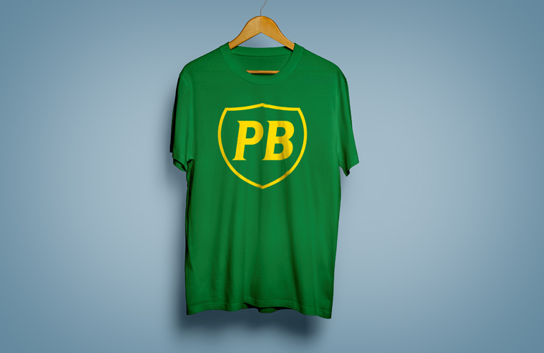
BP t-shirt designed by The Joneses

Personal best…

One that I’ve just found in the dim, distant and dusty archives, but a solution I still like!

In about 1999, my father-in-law asked me to design a t-shirt for the BP running club that he ran with.

The thing that all runners strive for, and talk about, is their personal best, or ‘PB’ – I transposed the letters in the company’s logo to reflect that.

Smashed it!