Keep up

News, views and general musings from the well-worn Joneses soapbox.

Township Rugby logo designed by The Joneses

A sporting chance…

In 2014 Lincoln Mali set up a rugby festival for township schools in and around Port Elizabeth. His goals were to establish a lasting legacy for his rugby loving father, to reinvigorate interest in local rugby, to provide support and incentives to keep young people in education and to make a beneficial connection to their communities.

Township was created as a resource generating enterprise to support Lincoln’s project and its wider aims. Their ambition, is to help develop a sustainable environment that will allow disadvantaged young people, from townships and villages, the chance to develop their talents and prosper.

The logo we’ve designed for them transforms the ‘H’ into the iconic rugby posts and is supported by the the strapline “a sporting chance for all”.

A try and conversion!

“Thank you so much for your help and guidance. The work’s great and we’re sure it will help with our fundraising.”

Rupert Daniell – Co-founder
Texel logo designed by The Joneses

She sells sea shells…

Texel are specialist credit and political risk insurance brokers. And we’ve just rebranded them.

The company’s named after a Dutch island that held fond memories for its founder. And from the shores of that island came inspiration for their new logo – the Texel shell.

When you beachcomb for shells, it takes a keen eye to seek out the most perfect specimens that nature can design. The same goes for Texel finding their clients the right insurance solutions – which, just like the best shells, are impeccably structured and offer superlative protection.

You can read more about the project here.

Credit and political risk insurance branding? We’ve got it covered!

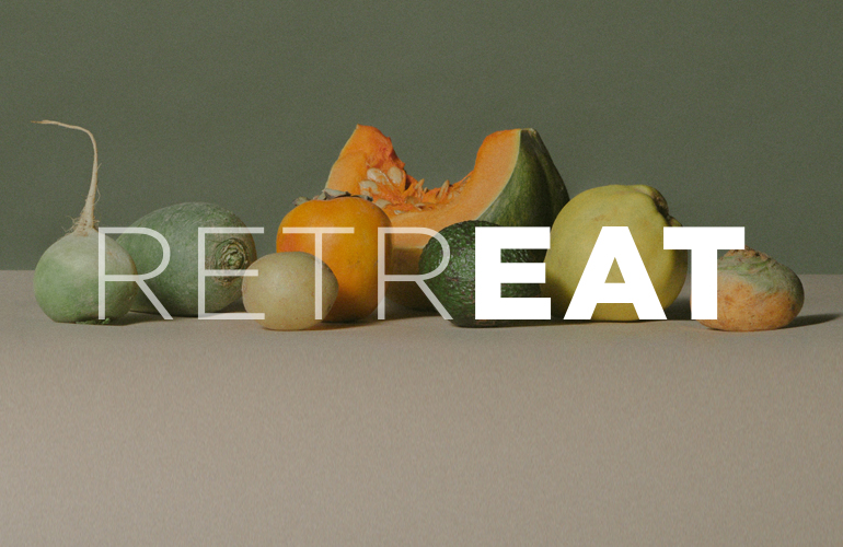
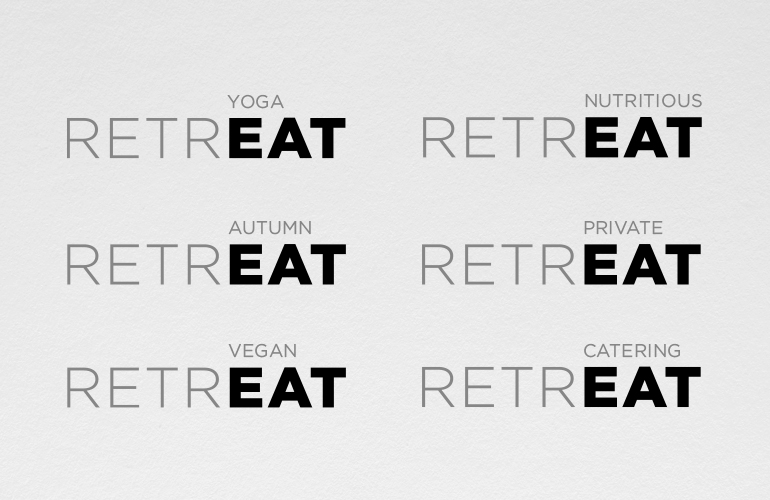
Retreat naturopathic catering logo designed by The Joneses

A balanced diet…

Ursula Lake is a naturopathic vegan chef.

She asked us for some help with naming her new venture and creating an identity for it.

We took inspiration from the reflective nature of the retreats that she sometimes caters for, as we thought it was an interesting parallel for the thoughtful, holistic and balanced approach she takes in preparing her food.

The typographic solution tells her story in a harmonious and campaignable way.

Tasty!


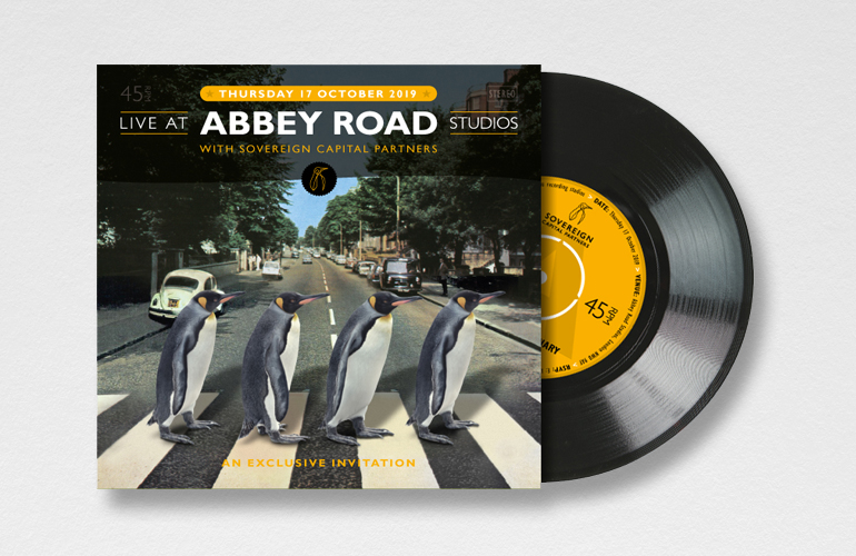
Sovereign Capital invitation designed by The Joneses

Zebra crossing?

We’ve just done a lovely invitation (even if we do say so ourselves) for our long-standing client Sovereign Capital.

Our brief was to design an invitation for an event they had planned at the world-famous Abbey Road Studios – synonymous with the legendary sounds of the Beatles who recorded 190 of their 210 songs there.

Our solution was to recreate the iconic Abbey Road record cover, but replace the Beatles with ‘Sovereign’ penguins instead. The event details were printed on a die-cut 7″ single inside the sleeve.

It’s been a big hit with their clients!

Bristow & Sutor logo designed by The Joneses

Cool, calm and collected

We’ve recently completed a rebrand for Bristow & Sutor, one of the country’s leading debt recovery businesses.

Stylised chevron bees, honeycombs and flowers, combine to tell a story of collection that you can read more about here.

A cool, calm and collected solution.

Pilates Circuit branding designed by The Joneses
Pilates Circuit signage designed by The Joneses
Pilates Circuit banners designed by The Joneses

A flexible identity…

A new logo for a long-term client Elliot Lake’s new venture, Pilates Circuit – a new form of circuit-based pilates that he’s introducing to the South-West London market.

Descriptive typography and bright gradients combine to provide the business with a contemporary look and feel.

A pretty flexible identity!

Kingston Grammar School minibus designed by The Joneses
Kingston Grammar School shirts
Kingston Grammar School minibus designed by The Joneses

KGS on tour

We’ve recently designed the graphics for Kingston Grammar School’s minibus fleet.

KGS’s iconic panelled sports kit provided the inspiration for our design, with the vehicles vinyl-wrapped to echo the school’s famous red and grey shirts.

Back of the net!

Swilken logo designed by The Joneses
Swilken photography art directed by The Joneses

On the tee…

Swilken is a full-service management, marketing and representation agency established to serve leading players, brands and events within the game of golf.

We thought that Swilken was a great name that not only referenced one of the most iconic landmarks in golf – the Swilken Bridge at St Andrew’s, but also described the way that the business spans the gap between their clients and the commercial world. Our logo described the bridge with a simple graphic twist.

Work has been rolled out across printed, electronic and digital platforms.

Fore!

Kingston Grammar School logo designed by The Joneses

A lesson in creativity…

Founded by Royal Charter in 1561, Kingston Grammar School is one of the UK’s leading independent co-educational day schools.

Having worked with the school on a number of projects, we were asked to evolve their coat of arms, which was drawn inconsistently and was proving difficult to reproduce.

Based on the 13th century crest of the Lovekyn family, and consisting of three eagles rising and three scallop shells, our brief was to refine the logo and deliver a more contemporary design.

Our solution consisted of more dynamic eagles, simplified shells, a cleaner shield and scroll and new typography. The work is currently being rolled-out across a wide range of materials.

You can read more about the work here.

Top marks!

The Crown Inn logo designed by The Joneses
Crown Inn signage designed by The Joneses
The Crown Inn stationery designed by The Joneses

Crowning Glory

The Crown Inn is a beautiful 17th century pub in the Cotswolds village of Church Enstone.

Following a recommendation from our client at Swire, the new owners, George and Victoria Irvine, asked if we could design a new logo for them.

We obliged with a distinctive idea that cleverly combines a traditional crown shape with two glasses.

Cheers!