Keep up

News, views and general musings from the well-worn Joneses soapbox.

Kingston Rowing Club logo designed by The Joneses
Kingston Rowing Club literature designed by The Joneses
Kingston Rowing Club banner designed by The Joneses
Kingston Rowing Club logo designed by The Joneses

Row, row, row your boat…

Founded in 1858, Kingston Rowing Club is one of the oldest rowing clubs in the world.

To mark their 160th anniversary, and to coincide with a British Rowing initiative to promote indoor rowing, we worked with the management team to provide a new logo and literature style.

The new identity took historical elements from the club, including the red and white stripes, the flag and the distinctive roof design of the boathouse, then combined them into a more heraldic shield that referenced the Royal Borough of Kingston upon Thames in which the club is located. Finally, crossed blades were reintroduced from an older iteration to give a more traditional feel.

A stroke of genius…

Kingston Grammar School Summer Ball logo designed by The Joneses
Kingston Grammar School advertising designed by The Joneses

Ball or no ball?

We’ve recently been helping Kingston Grammar School with an identity and campaign for their 2018 Ball.

This year, the event will will be held at The Oval, the home ground of Surrey County Cricket Club. With that in mind, our identity combines a cricket ball with a bow tie, and introduces a copy-led campaign that sets a distinctive tone for the evening.

Howzat?

Eden Futures logo designed by The Joneses

Picking a new brand

Our latest project is a rebrand for Eden Futures.

Eden delivers exceptional support services to people with autism, learning disabilities and complex needs.

Our connected ‘e’ flower logo is a metaphor for the way they nurture and nourish their service users until they grow and blossom into people who are capable of leading fulfilling, independent lives. 

The ‘bouquet’ is also suggestive of the teamwork that is vital to their business and to the garden of Eden – without being overtly biblical!

Hopefully it’ll grow on them!

You can read more about the work here.

Nurseplus logo designed by The Joneses

A healthy dialogue

We’ve just finished a rebranding project for Nurseplus, a health and nursing care agency.

Our proposition was that good care is about dialogue. Whether that’s a patient talking to a doctor, a patient talking to a carer or even members of staff conversing with each other.

With that in mind, the new logo is made up of two speech bubbles that leave an ‘N’ for Nurseplus in the space between.

You can carry on the conversation here.

Opera Show logo designed by The Joneses
Opera Show designed by The Joneses

Curtain up…

Our identity for a new opera programme, the ‘Opera Show‘ has just gone live.

Set up by one of the country’s most promising tenors, Thomas Elwin, it aims to be  a ‘One Show’ for opera.

With content that will include interviews with opera creators, profiles of opera companies, advice about where to study, details on how to get tickets, tips on where to watch shows and much more, Tom hopes that the channel will appeal to the primarily millennial YouTube audience and give them a path into opera.

The proscenium arch features in most opera houses and serves as a window to the performance. We took the shape of the Royal Opera House’s as our inspiration for the logo, and added a graphic curtain, rising to reveal the name of the show.

Toi, toi toi!

Leeds United FC badge designed by The Joneses
Leeds United FC logo rationale by The Joneses

A logo to unite Leeds

There was a huge furore yesterday when Leeds United Football Club unveiled their newly-designed crest.

Supposedly, the logo is ‘an expression of the passion that connects Leeds United’s fans and players on and off the pitch and all over the world’. We were told that it concluded a ‘rigorous’ six month process that included over 10,000 consultations – hmmmm…

Needless to say, the faithful revolted with some brutally negative feedback and within a few hours of the launch, more than 70,000 had signed a petition to stop its implementation. The club’s Managing Director was soon telling the BBC that they would be reconsidering the project.

As a lifelong supporter, I couldn’t help but wonder if there was a nice way to symbolise Leeds and football in a strikingly simple way.

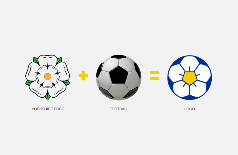
We found that if we combined the white rose of Yorkshire (historically used by the club) with an iconic drawing of a football, we could make a rose/football logo. Distinctive, relevant and ownable.

Let’s see if they agree!

“Marching on together” as they sing at Elland Road.

Marcelle Ruth logo designed by The Joneses
Marcelle Ruth business card designed by The Joneses

Taking care of the big C

We’re currently working on a brand positioning project for a cancer centre whose aim is to bring world-class, state-of-the-art cancer care to Nigeria.

The management team tasked us with first naming the business, then coming up with a distinctive identity.

After extensive research, we settled on Marcelle Ruth as the name, in memory of the founder’s mother-in-law, who lost her life to cancer.

For the identity, we liked the idea that a hug, or simply putting your arm around someone’s shoulder, is symbolic of caring and of being cared for. That was a fundamental experience which we believed Marcelle Ruth should embrace. We also like the idea of the logo having an emotional warmth rather than being corporate and faceless – that’s how good care should make you feel!

We brought the concept to life through a sophisticated, elegant and classic typographic approach where the letter ‘R’ extends to look after, and embrace, the ‘C’ (cancer being commonly referred to as the big C).

The project is ongoing and being rolled out across digital, print and three dimensional applications.

Mind logo designed by David Jones

D&AD – Best of branding

Bruce Duckworth, past D&AD President, recently shared his favourite pieces of pencil-winning branding on the D&AD website. Nice to see my Mind logo in his picks – still a lovely piece of work, even if I do say so myself! You can see the film here.

Kronenbergs logo designed by The Joneses
Kronenbergs icon designed by The Joneses
Kronenbergs visual language designed by The Joneses

You’ve been framed…

There’s an excellent and highly-respected picture framer in Kingston upon Thames called Josh Kronenberg. He frames all our art and also does a lot of work for our clients.

His business was called Anderson Hill, a remnant of an era long-gone, but thinking it might be time for a change, he asked us to help him with a rebranding exercise.

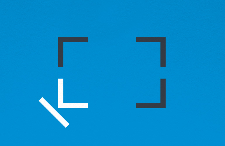
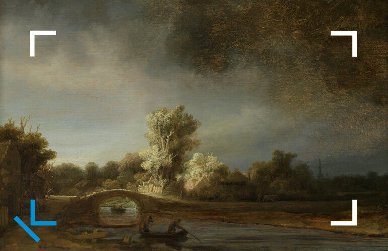
With Kronenberg being such an unusual and memorable surname, and more relevant to the business today, we suggested adopting it as the name of the business and set about designing a new logo for him. Our solution took the ‘K’ from his name and used it as one of the four corners of an abstract frame icon, with proportions all based on the golden ratio. It’s designed with flexibility in mind too so that it can adapt to any shape or size.

We’ll add a few more pieces to the gallery as the project rolls out!

60/90 logo design by The Joneses
60/90 racing helmet design by The Joneses
60/90 logo design by The Joneses

And – there – they – go!

We recently completed a logo for a client who races vintage Lotus cars – 60 and 90 being their respective numbers.

We simply took the two numbers, arranged them to look like tyre tracks on an abstract plan of a racing circuit, then coloured them in the classic yellow and green Lotus livery.

As the legendary Murray Walker said, “Let’s stop the startwatch”.