Keep up

News, views and general musings from the well-worn Joneses soapbox.

Elliott Mould logo designed by The Joneses
Elliot Mould brand imagery designed by The Joneses
Elliott Mould logo designed by The Joneses

Game, set and match…

Elliott Mould is the world number 1 Touch Tennis player with 29 career titles to his name.

As the coaching side of his business was gaining momentum, Elliott asked us to come up with a logo that would help give some focus to his brand.

Wanting to steer away from the overused imagery associated with tennis, our solution was to create a racquet string monogram from his initials.

Advantage Mould.

“It looks awesome! I’m sitting here thinking that it’s just so clever! I love it – thank you!”

Elliott Mould – Founder
RiverCrossing logo designed by The Joneses

Making connections…

We’ve just completed a rebrand for RiverCrossing, an independent investment management firm that specialises in alternative investments for Islamic investors.

You can read more about the project here.

“Thanks for a great job, for all your flexibility, impeccable execution and above all your creativity and ability to listen to your client. We are very happy!”

Emira Soccoro – Partner
Arkarius logo designed by The Joneses
Arkarius logo inspiration designed by the Joneses
Arkarius brand strategy by The Joneses

The bottom line

As we approach year end, we thought we’d show a naming and identity project we’ve done for the UK’s largest provider of limited company accountancy services.

Following a period of mergers and acquisitions by the owners, we were asked to create a name and identity for the newly formed group.

For the name, we came up with ‘Arkarius’, a Latin derivation which translates as controller of the treasure chest. Then the logo simply echoed the vernacular of accounts, columns and calculations to convey the sum of the parts!

The brand strategy revolved around the idea of ‘strength in numbers’ – a nod to both the group nature of the business and their core competency.

Now, where are those receipts?


The Picture Book House logo designed by The Joneses

Once upon a time…

We’ve recently completed an identity project for The Picture Book House – an independent publishing venture specialising in illustrated children’s books.

Their goal is to create a company that places more importance on the books than the business, so we designed a logo where the house is nothing without the books.

And they all lived happily ever after.

The end.

First footing story by The Joneses

Best foot forward…

New Year’s Eve is marked around the globe in spectacular fashion.

Although not as extravagant, the ritual of first-footing, observed in Northern England where I grew up, involves a tall, dark man, bearing gifts, being the first person of the year to cross the threshold and welcome in the New Year.

The popular belief is that the dark stranger at the door is a response to the Viking invasions, when the arrival of a blonde man with an axe usually meant trouble! It’s also commonly thought that the first-footer should bring a lump of coal to ensure warmth in the house for the year ahead.

And… the first over the doorstep can claim a kiss from every woman in the house too – excellent!

With warmest wishes for 2017!

Interflight logo designed by The Joneses
Interflight inspiration from The Joneses

Interflight, you are cleared for takeoff

We’ve just launched a new identity for Interflight – one of the most experienced and established private jet operators in Europe.

Bizarrely, our inspiration for the identity came whilst looking at a departures sign in Gatwick Airport! When we saw the icon we thought it looked like an ‘F’ on its side, so tried to incorporate it as the ‘F’ from Interflight’s ICAO call sign – IFT.

You can read more about the project here.

Mind Zone logo designed by The Joneses
mindzone t-shirt designed by The Joneses

Using our brain with an identity for Mind Zone

We’ve recently completed a little project for Mind Zone, a new tennis and life skills programme which utilises the latest psychological research to inspire children aged 3–14 to realise their potential in tennis and in life.

The typographic identity is simply drawn to look like an abstract brain.

40-Love!

Ababo logo designed by The Joneses

Positive or negative?

We were recently commissioned to name a haematology business for one of the country’s most well-respected consultants.

Our solution took the main blood types: A, B, AB and O as our inspiration, then merged them to create the new name – Ababo.

Simple typographic shapes draw on the idea of blood cells to create a distinctive and minimalist logo.


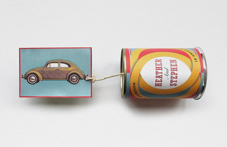
Wedding invitation designed by The Joneses

Tin cans and weddings

It is thought that a form of this tradition first began in Egyptian times as a way of protecting the marriage by warding off any evil spirits, as the couple started their journey together. These days, tying tin cans to the back of the married couple’s car is simply intended to bestow good luck.

We thought it might be a nice idea for a wedding invitation. So, we printed all the wedding details on to a bespoke label wrapped that around a tin can, then tied the can to the bumper of a Beetle.

Bunny Bows logo designed by The joneses
Compass logo designed by The Joneses

Following in footsteps

My daughters both had to do a little logo design at school recently. This is what they came up with.

As a consequence of their actions, they’ve had all their pens taken away, been grounded for a month and told to never try and upstage their Dad again.

And, in the hope that they’ll stop worrying me and become highly-paid Q.C.s instead, they’ve been given extra law homework for the Easter Holidays.

Alta peto girls!