Keep up

News, views and general musings from the well-worn Joneses soapbox.

Holy Cross Prep School one colour disco poster designed by The Joneses
The Joneses have designed a poster for the Holy Cross Prep School disco

A colourful evening

Once every couple of years there’s a parents’ disco at my daughter’s school.

This year’s had a theme of ‘one colour’ with parents asked to wear a single hue for the evening.

Our solution for the poster was to show the record labels of a number of colourful hits such as ‘Blue Monday’ by New Order, ‘Little Red Corvette’ by Prince and of course, ‘Green Door’ by Shaky.
Wedding invitation designed by The Joneses

A heart for Valentine’s Day

An old client, Sarah, was getting married to a chap called Scott and she wanted a wedding invitation.

The idea was to take a letter ‘S’, flip it, then intertwine the two. The result not only signified their union, but also left the shape of a heart.

Happy Valentine’s Day!

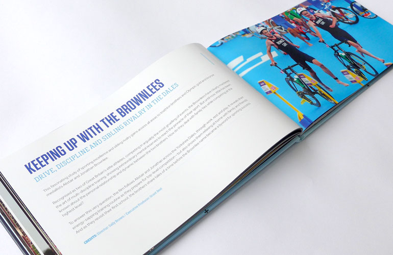
BT Sport book designed by The Joneses
BT Sport book spread designed by The Joneses

A book of the films

BT Sport Films has been responsible for some of the most highly acclaimed sporting documentaries of recent years; stories covering everything from TT greats to giant-killing football teams.

We were tasked with designing a book that could be used as both a memoir and a marketing tool.

Our screen-sized solution extended the graphic language of the TV channel and recorded those stories in a beautifully printed keepsake.

Michelle Zelli logo designed by The Joneses
Michelle Zelli business card designed by The Joneses

A logo is for life…

Michelle Zelli is one of the UK’s most respected and intuitive life coaches.

Her brief to us was simple; design a luxurious identity and business card.

Michelle’s clients call her “MZ” which seemed like a good starting point for the new logo. With that in mind, our design for the monogram cleverly combined an “M” and a “Z” to create a distinctive and modern mark that reflected Michelle’s reputation and ambition.

Adding to the premium feel of the work, the cards featured embossed textured paper, foil blocking and copper gilded edges, all printed beautifully by our friends at Empress.

“I am sitting in a power cut, I have loads to do, no wi-fi and my head hurts. But you just made all that melt away. I love it. Speechless (for a change) but so full of gratitude and awe.”

Michelle Zelli – Executive and life coach
Hocking wedding invitation designed by The Joneses

An Entente Cordiale

The Entente Cordiale was a series of agreements signed on 8 April 1904 between Great Britain and France which saw a significant improvement in Anglo-French relations.

So, when an English friend of ours announced his intention to marry his French fiancé, and we were tasked with designing the invitation, we thought it might form the basis of a nice idea.

Heraldic illustrations of a rooster and lion took pride of place for their very own entente trés cordiale and symbolised their union.

Elliot Lake logo designed by The Joneses

Fit for purpose

Elliot Lake is one of London’s most experienced fitness experts and personal trainers.

He asked us to design him a logo.

Our solution took the form of a classic ‘EL’ monogram.

Timeless, elegant and fit for purpose!

Wedding invitation designed by The Joneses

With this ring…

One from the wedding album…

My cousin Matthew and his fiancé Elaine asked me to design a wedding invitation for them.

I noticed that the word ‘marriage’ ended and began with their initials – all very fortuitous!

So I arranged the word in a circle, foil blocked a gold ring, embossed the letters and added a subtle ampersand between the initials E&M.

You may kiss the bride.

Galapagos Conservation Trust logo concept designed by The Joneses

One that got away… slowly

A few years ago, we were asked to advise The Galapagos Conservation Trust on their branding. One of the things that struck us was that their logo, depicting the famous Galapagos giant tortoise, George, could be easily modified and improved.

Our suggestion was to take a hand-drawn letter ‘G’ for Galapagos, turn it on its side and add a graphic eye to create a much bolder, more distinct identity.

We loved it, but sadly it never saw the light of day… until now!

Why free pitching is wrong…

Although we do some free work for friends, family and charities, here’s an excellent film explaining why creative businesses shouldn’t give their work away for nothing.